Independent
Mobile app · Product concept
A—Book.®
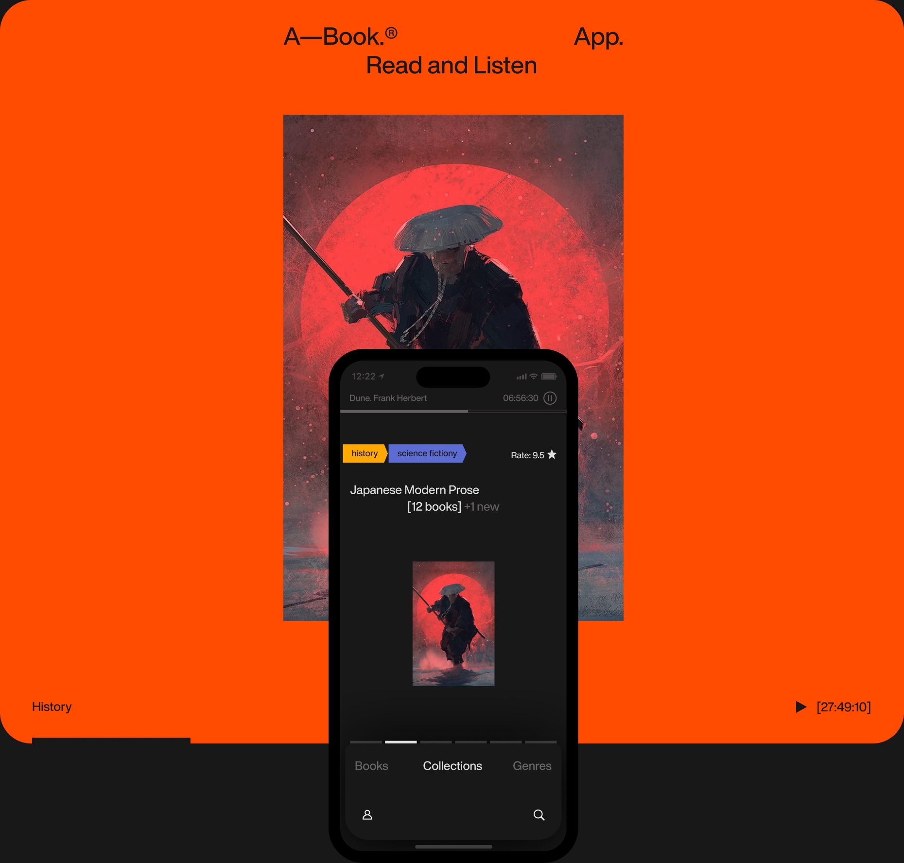
Read and listen to the same book. Keep your place and everything worth saving.
- Role
- Product Designer
- Format
- Mobile concept · CDTP coursework
- Research
- 6 interviews
- Art direction
- Sergei Gurov
Audiobooks fit life on the move. Highlighting passages, taking notes and finding a precise fragment are harder. A—Book explores a shared reading and listening experience, informed by six interviews.
01 / The library
A library with an editorial point of view.
Books, authors and collections as connected ways to explore.
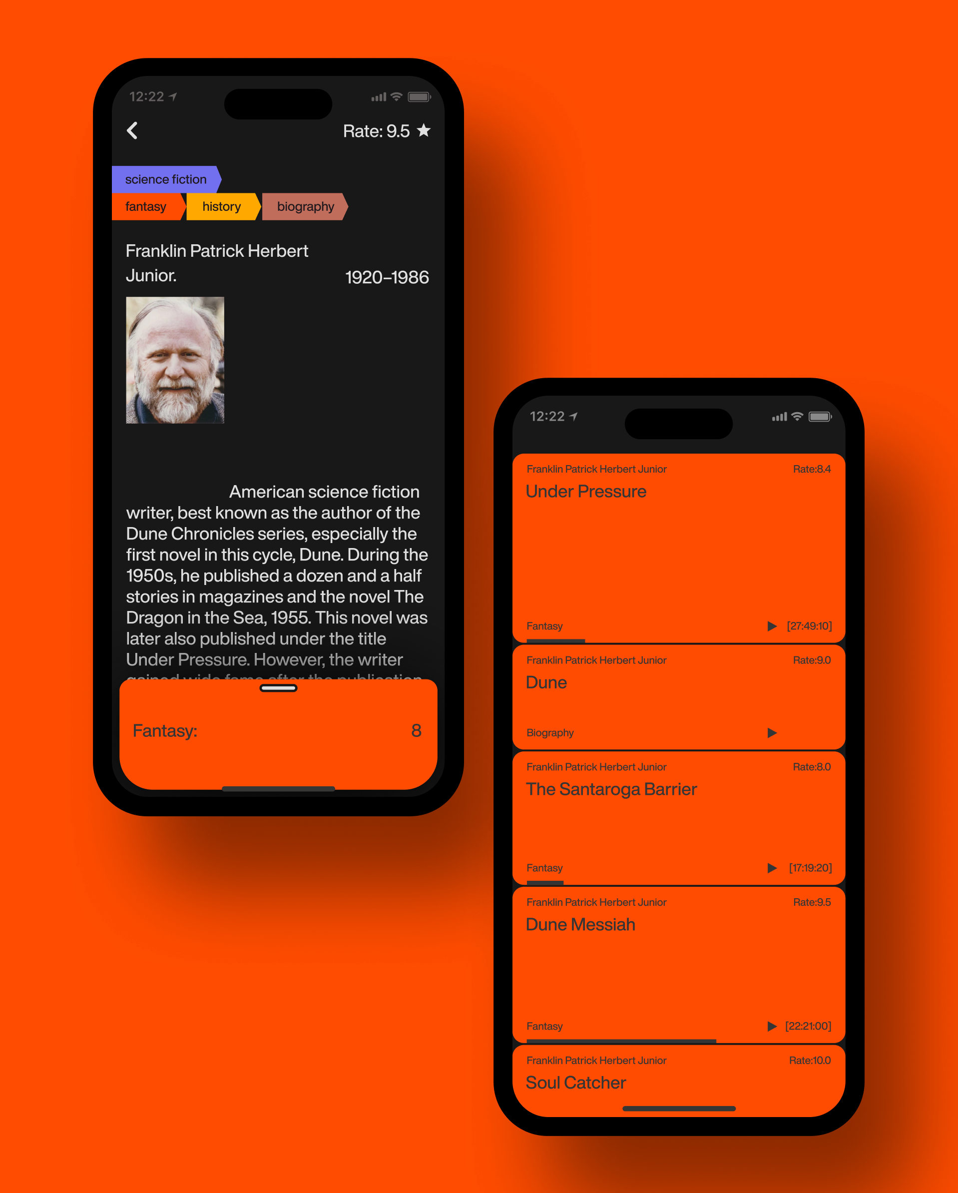
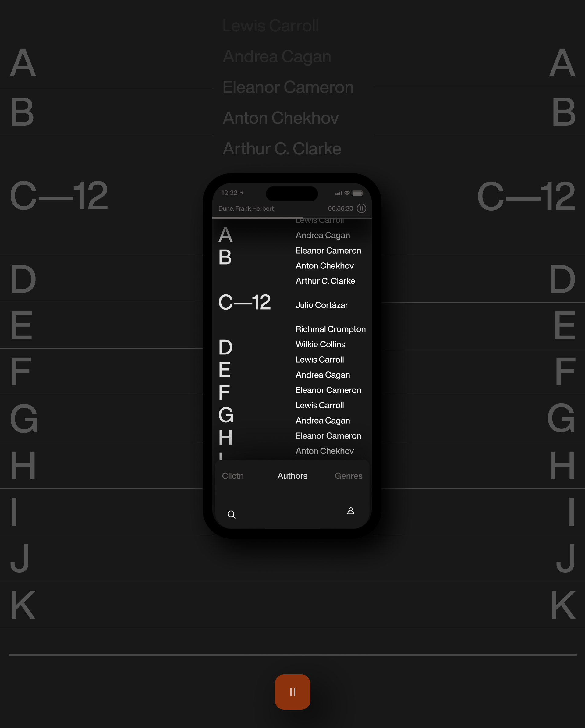
Finding the next book was part of the problem, not just playing it. I connected collections, authors and genres so a reader could follow an interest instead of starting another search.
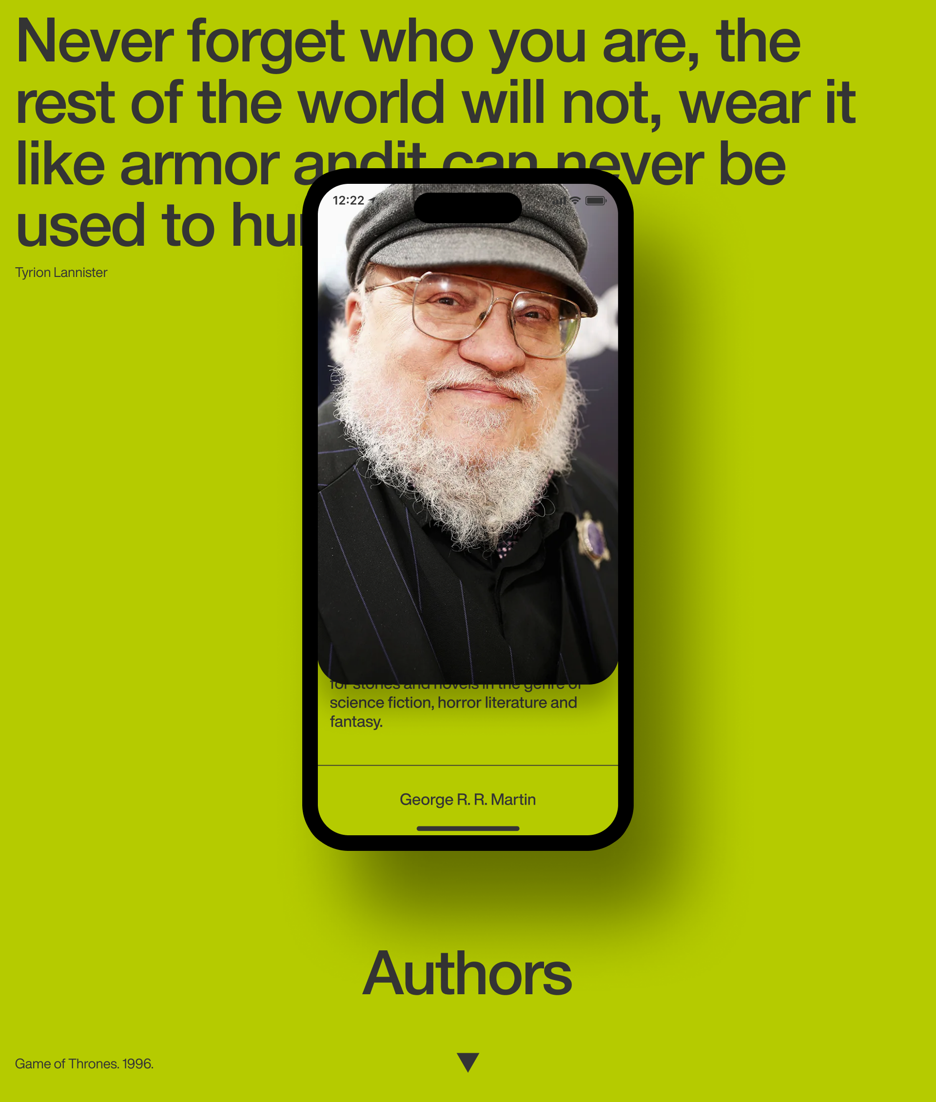
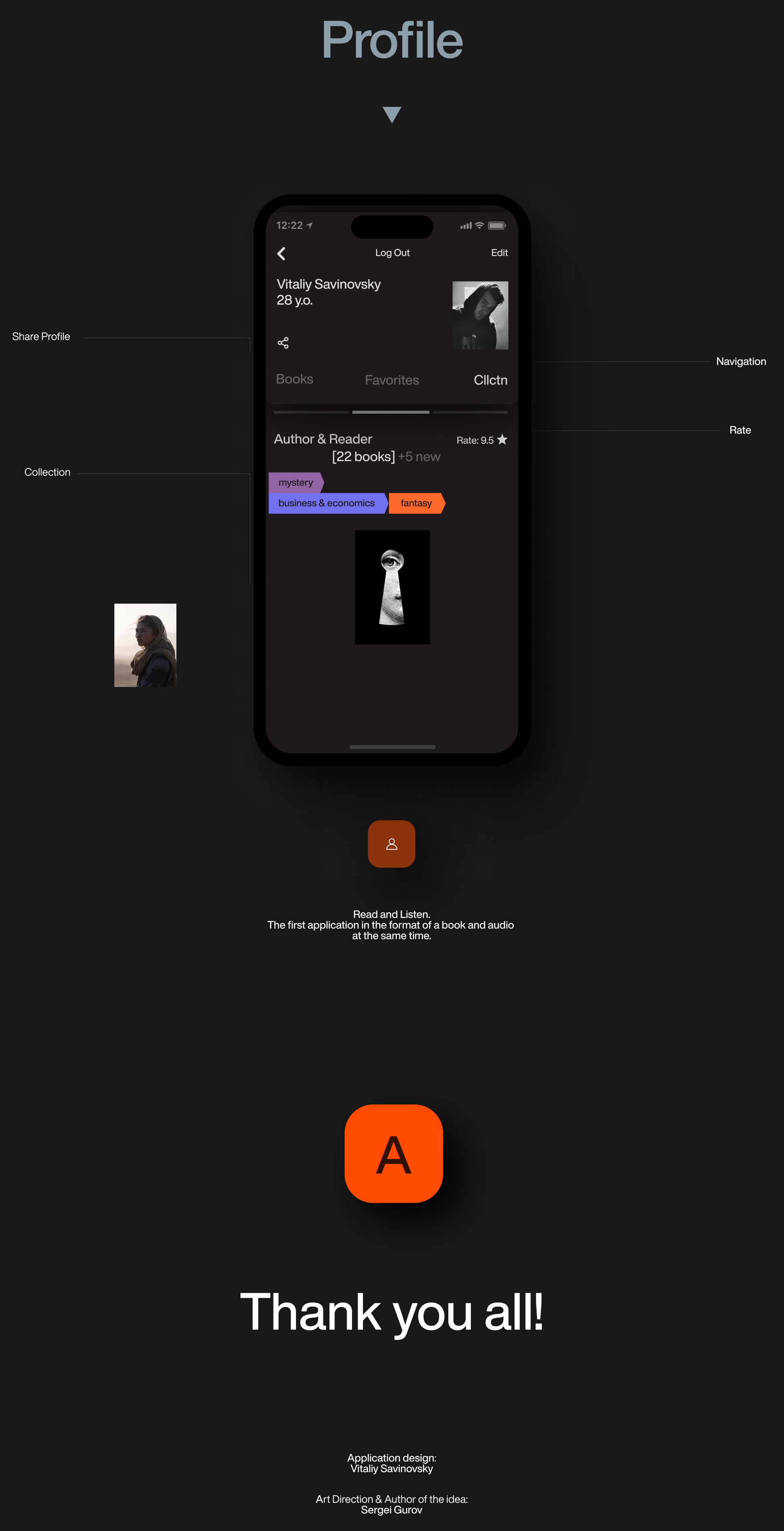
The current audiobook stays visible while browsing. The profile brings personal books, favorites and collections together, while author pages offer a direct route to more work by the same writer.
Large type, portraits and genre colors give each part of the catalogue its own character. The visual direction was developed within the Theory and Practice of Compositional Design course, with art direction by Sergei Gurov.
02 / Research
The same book, different moments of the day.
How people choose a book, switch formats and return to a passage.
I ran four text interviews with classmates and two interviews with acquaintances to understand where people read or listen, how they choose books and what they struggle to return to.
The contexts ranged from focused reading at home or at work to listening during a commute, housework or driving. Those situations ask for different levels of attention, but the book and the reader’s place should stay the same.
The job stories highlighted three gaps: choosing a book without a long search, recovering a particular passage, and keeping material that audio alone can miss — notes, quotations and illustrations.
These became design hypotheses: curated collections could make selection easier; linked text and audio could help recover a passage; and ready-made quote layouts could reduce the effort of sharing.
03 / Architecture
Many ways in. One book at the centre.
The player is part of the library, not a separate destination.
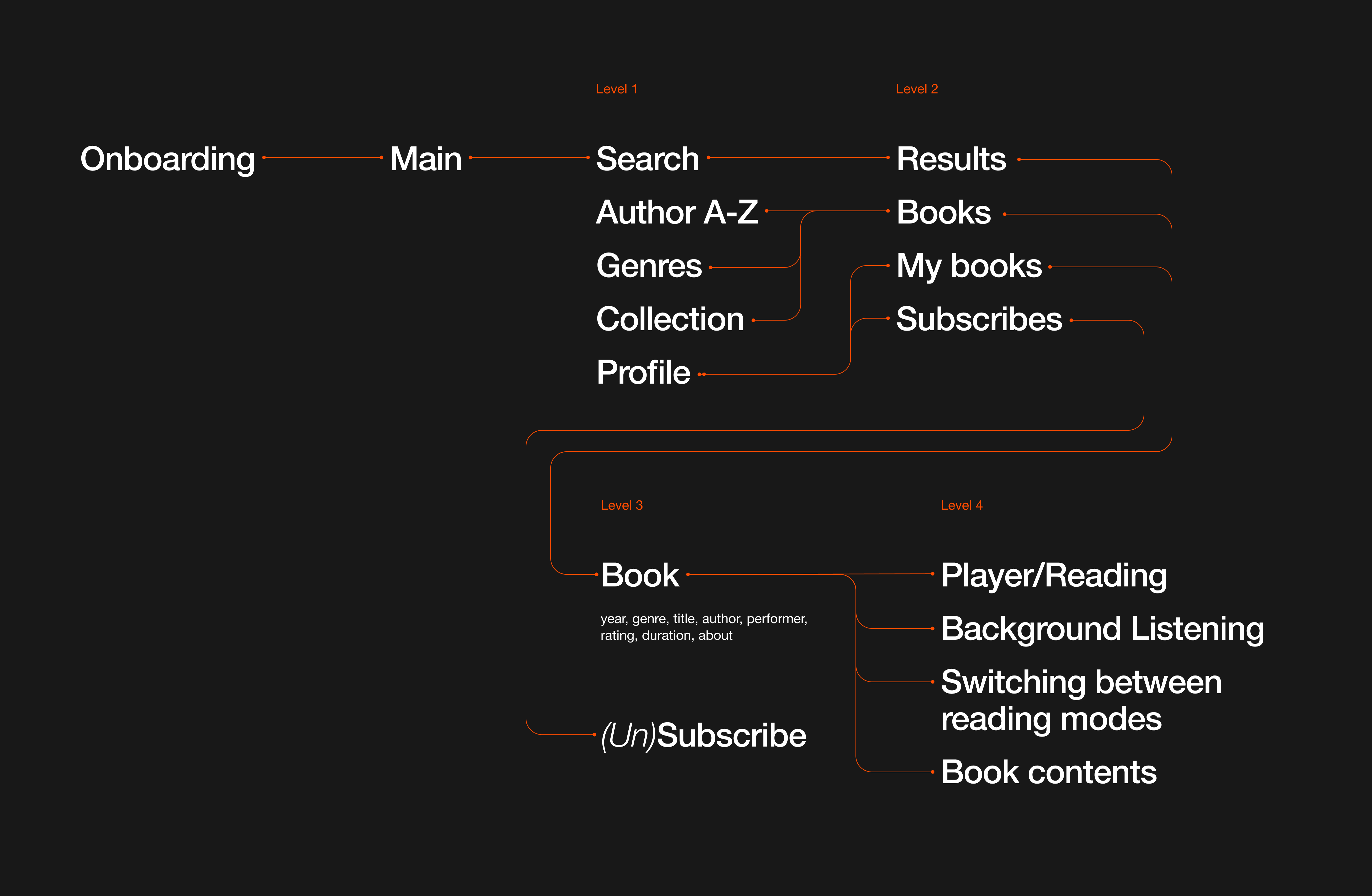
I mapped discovery separately from consumption: search, authors, genres and collections lead to the same book view. From there, the reader can open the text, listen in the background or move between formats.
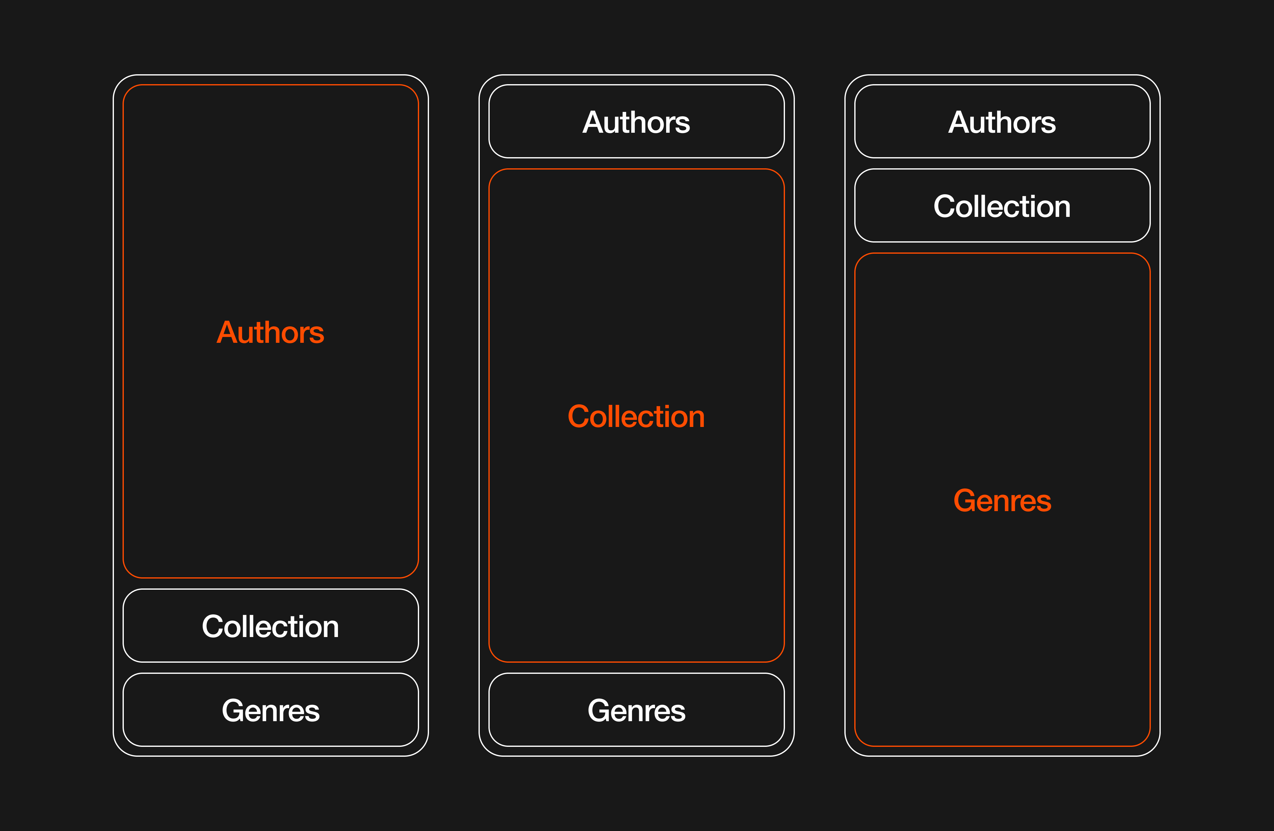
The navigation exploration keeps neighbouring areas in view. It was a way to preserve orientation when changing sections, while the book remains the shared object across the whole experience.
04 / Reading & listening
One book. Two ways to stay with it.
Shared progress is the central product hypothesis.
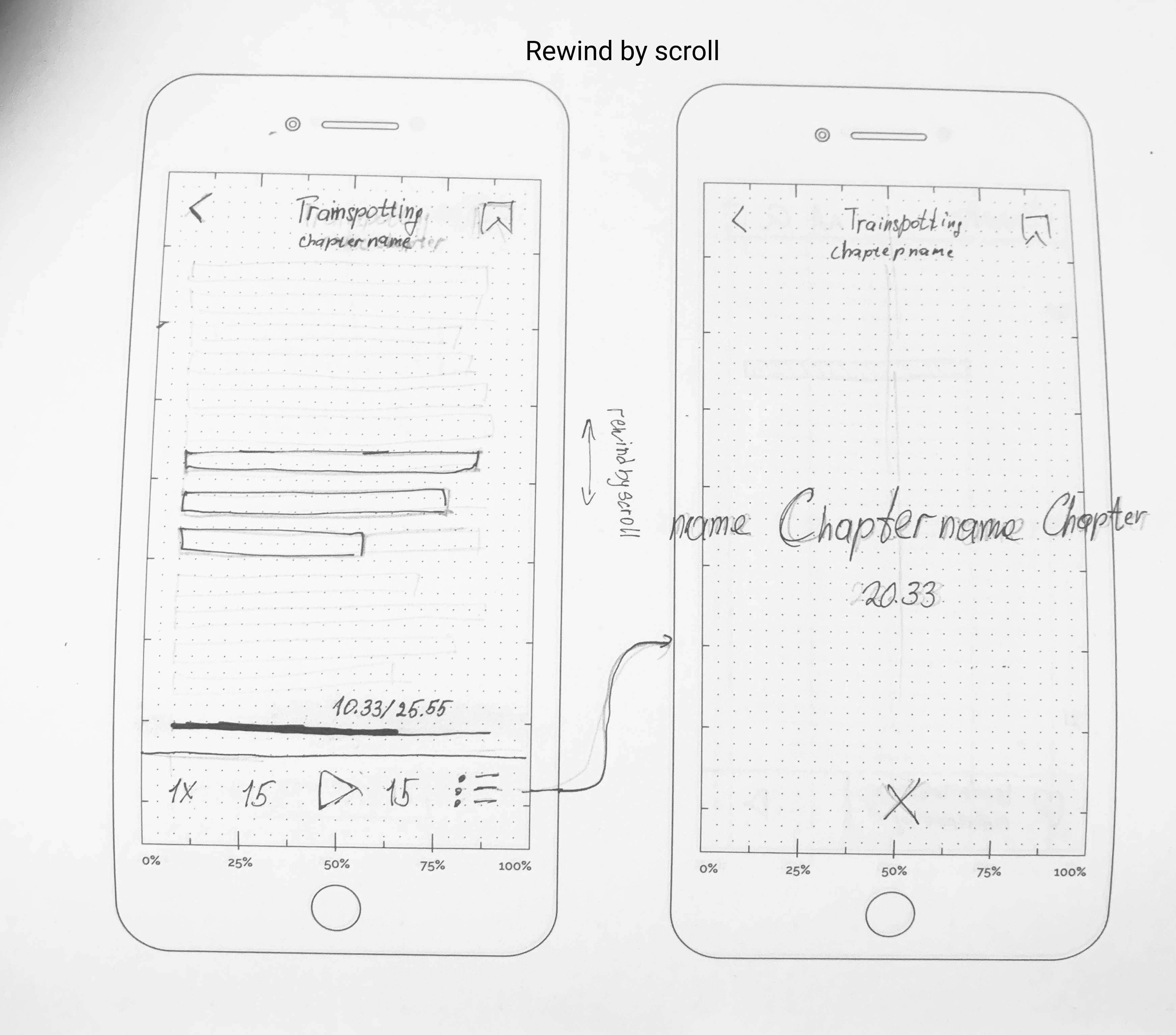
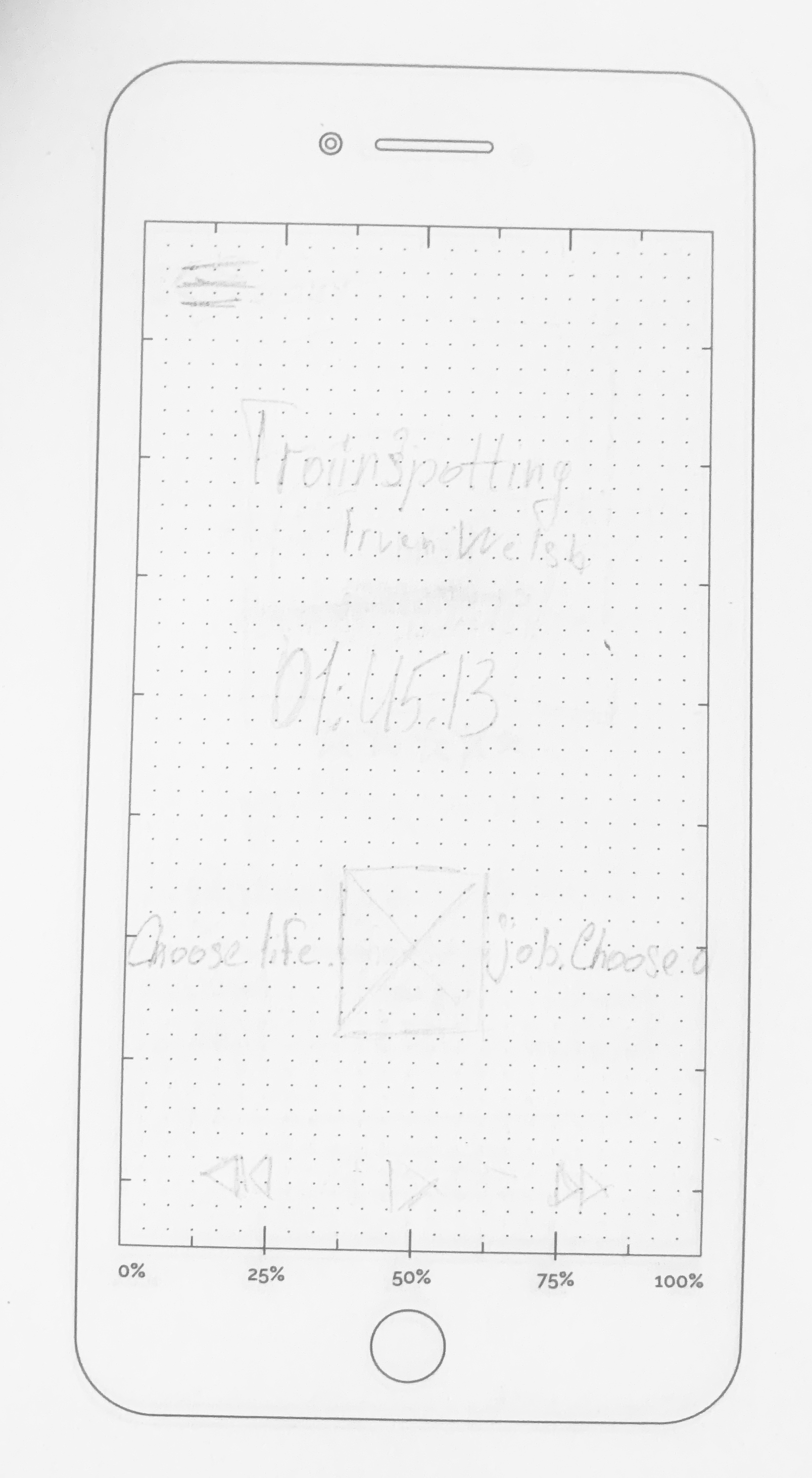
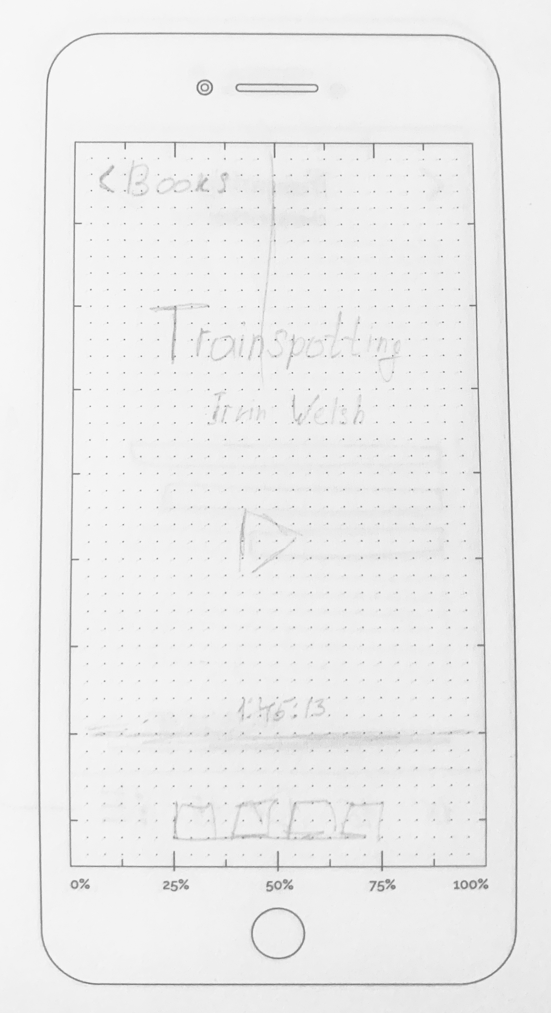
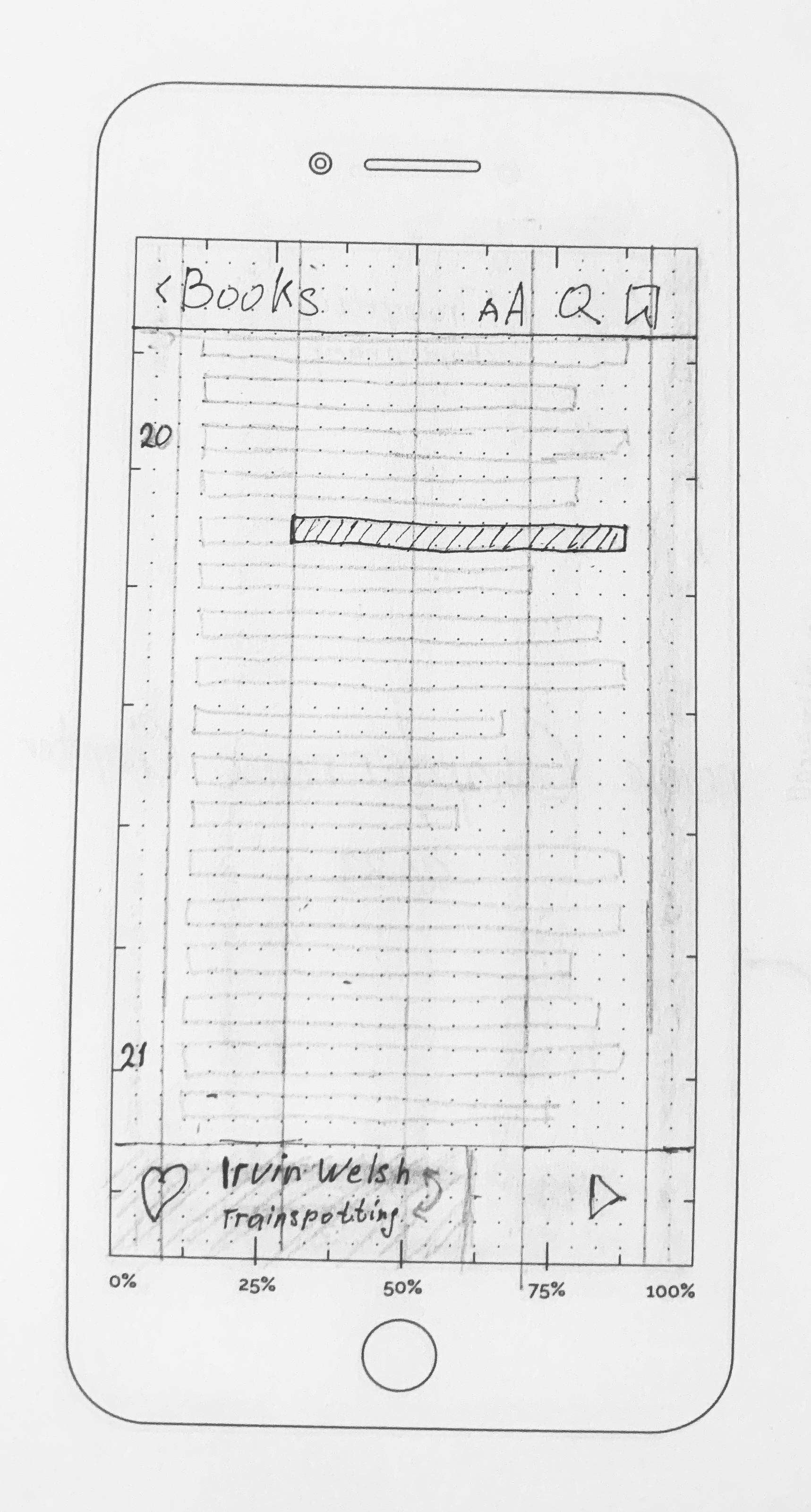
The player was the central interaction challenge. A conventional audiobook surface makes playback obvious, but gives little space to the passage itself. A reading surface has the opposite trade-off.
I explored both directions in sketches: time-led playback, chapter navigation and a text-led mode with persistent audio controls. The aim was to make switching formats a continuation of the same activity.
Bookmarks, notes and illustrations belong to this shared context as well. The drawings capture the alternatives behind the concept, before the final visual direction.
05 / Quotes & sharing
Keep the words that stay with you.
A saved fragment keeps its book and author attached.
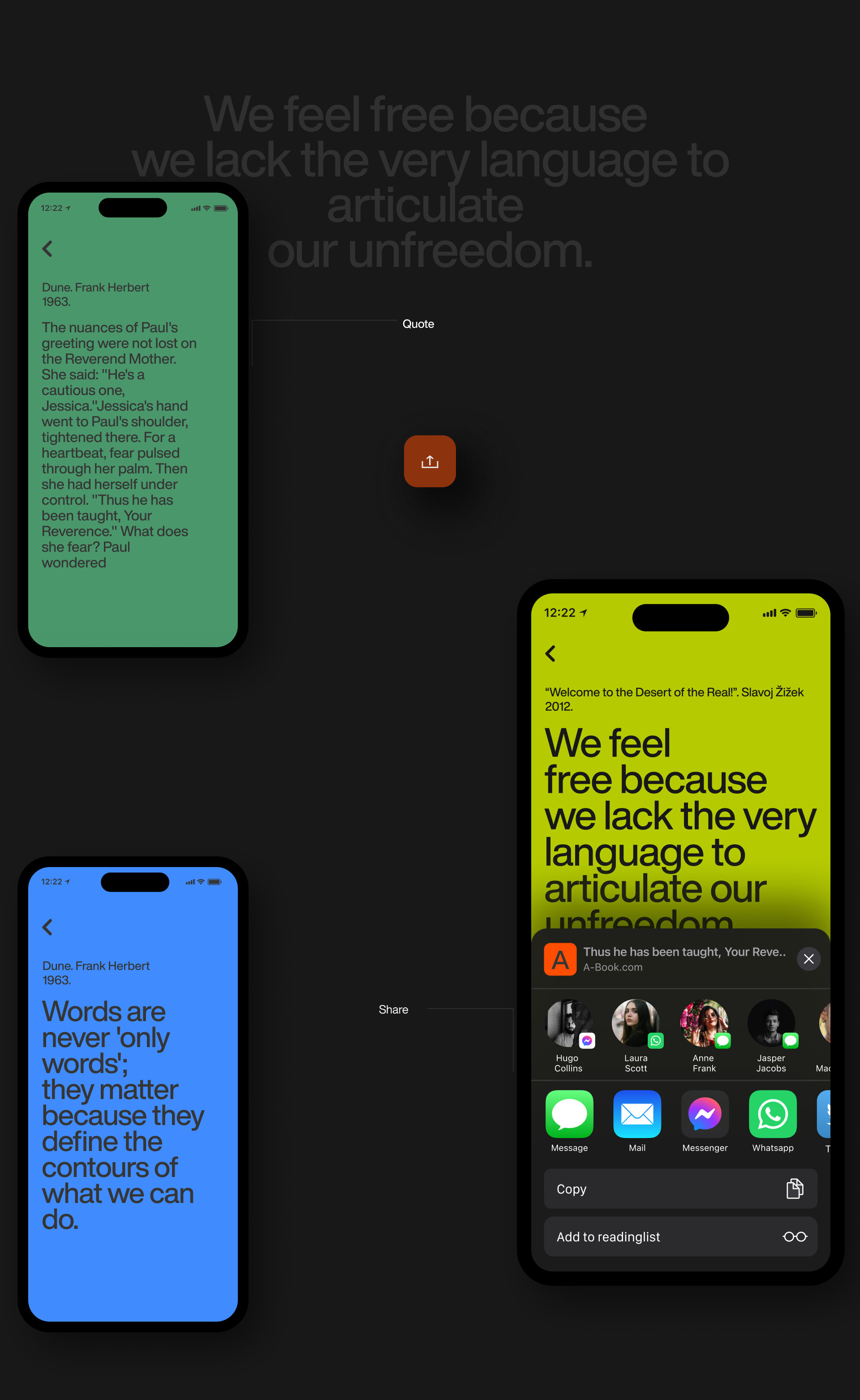
The research identified a gap between hearing something worth keeping and being able to find or share it later. The concept gives that fragment a visual form without separating it from its source.
Quotes use a compact editorial layout, with the book and author visible alongside the text. The sharing flow connects to the familiar native share sheet, so a reader does not have to recreate the quotation in another app.